Selected Print and Digital Works for Nova Science Publishers, Inc.
Assorted book cover and marketing deliverables created as part of my in-house role within Nova Publishers.


Nova Science Publishers is an academic publishing house based in Hauppauge, New York which specializes in STEM, medicine, and the social sciences. The company releases hundreds of new titles each year, and plays an important role in the careers of an ever-expanding network of publishing authors.
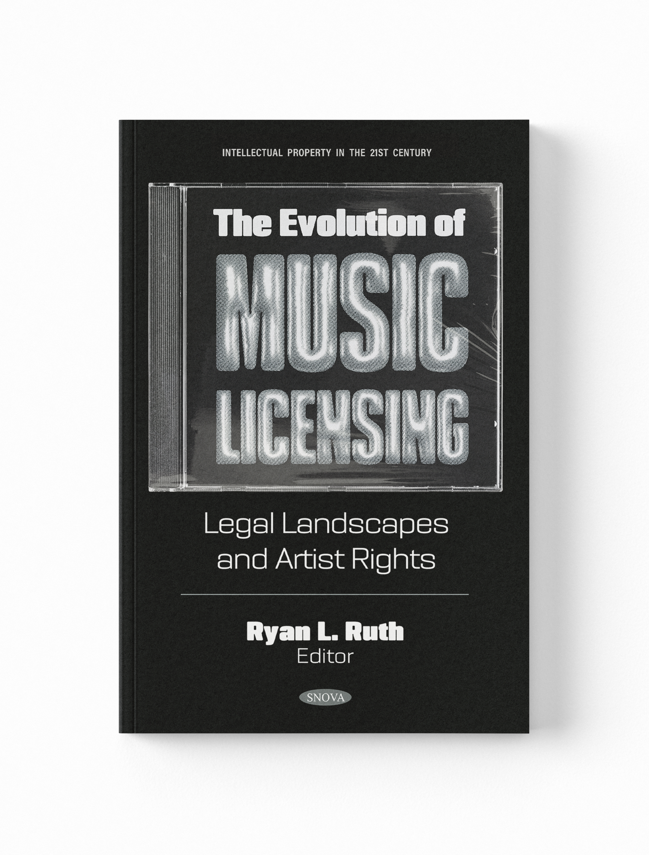
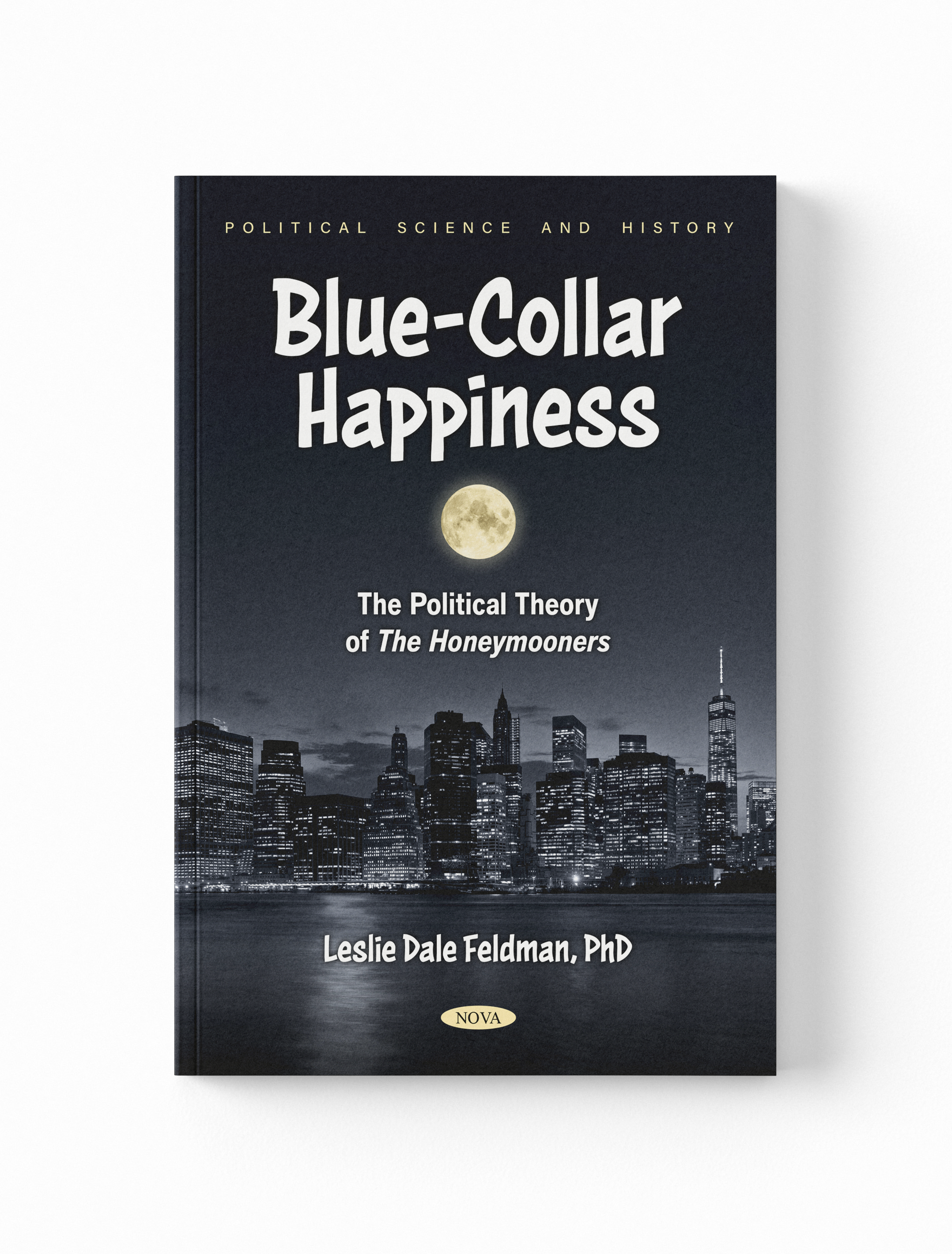
As a key member of Nova’s Art department, I’ve occupied a unique intersection of the company’s marketing and production efforts. During my time with the company I’ve designed over 600 unique, production-ready book covers for titles on a wide array of academic and technical subjects, working closely with both Nova’s Printing & Binding Department, and the company’s large body of clients in the process.
Additionally, I’ve worked alongside Nova’s Marketing Department to create a large variety of outward-facing promotional materials for a diverse range of purposes. Projects in this vein have included assets for both the company website and social media accounts, graphics for marketing emails, printed material to promote various Nova releases (i.e. flyers distributed at conferences, mailers sent to vendors to advertise new releases) and overarching identity systems for the company’s annual series of catalogs.


Above: specimens of “Nova Avant Garde”, a custom lettering system created in 2025 for Nova’s annual catalog series.


Above: selected logo redesign concepts, each inspired by different key elements of Nova’s brand identity.


Visual Identity Proposal for “Shadows for Sale”
Minimalist visual identity system created for Purchase College School of Art + Design’s Spring 2020 MFA thesis exhibition.
In the Winter of 2020, I was part of a team of student designers tasked with creating, pitching, and implementing a visual identity for “Shadows for Sale”, the upcoming graduate exhibition for Purchase College’s Master of Fine Arts program. Our clients were the small body of participating artists, along with a handful of members of the school’s faculty who were involved in coordinating the event. The title “Shadows for Sale” was selected by the participating artists, and was in reference to an (alleged) ancient practice in which individuals would “auction off” their own shadows for ceremonial purposes.
My proposed visual identity was concept-driven, and hinged on ideas pertaining to light, illusion, and intangibility. At the core of my pitch was the project’s biggest deliverable, a branded exhibition pamphlet set to contain information about the featured artists and their work. Jost was selected as the primary typeface for this project—its circular forms and sharp angles lend themselves well to the simplified geometry my proposal was constructed around, while qualities such as its double-story “a” letterform cultivate somewhat of a classic and sophisticated tone.