Visual Identity Proposal for Shadows For Sale

Minimalist visual identity system created for Purchase College School of Art + Design’s Spring 2020 MFA thesis exhibition.
In the Winter of 2020, I was part of a team of student designers tasked with creating, pitching, and implementing a visual identity for “Shadows For Sale”, the upcoming graduate exhibition for Purchase College’s Master of Fine Arts program. Our clients were the small body of participating artists, along with a handful of members of the school’s faculty who were involved in coordinating the event. The title was selected by the five participating artists, and was in reference to an (alleged) ancient practice in which individuals would “auction off” their own shadows for ceremonial purposes. The core deliverable of this project was a branded exhibition pamphlet containing information about the exhibition and its participating artists, with the idea being that a website and broader suite of marketing materials would be created in its likeness.
My proposed visual identity drew inspiration from the name by focusing on ideas pertaining to light, illusion, and intangibility. The exhibition pamphlets were set to be printed on cheap newsprint paper that had a bit of transparency to it. This inspired a cover concept in which the front cover doesn’t contain the full exhibition title, but appears to due to its inclusion on the first page (an animation which demonstrates this can be found below this text.)
Jost was selected as the primary typeface for this suite of designs—its circular forms and pointy angles lend themselves well to the simplified geometry my proposal was constructed around, while I’m particularly fond of its elegant, modern appearance and inclusion of a double-story “a” letterform.
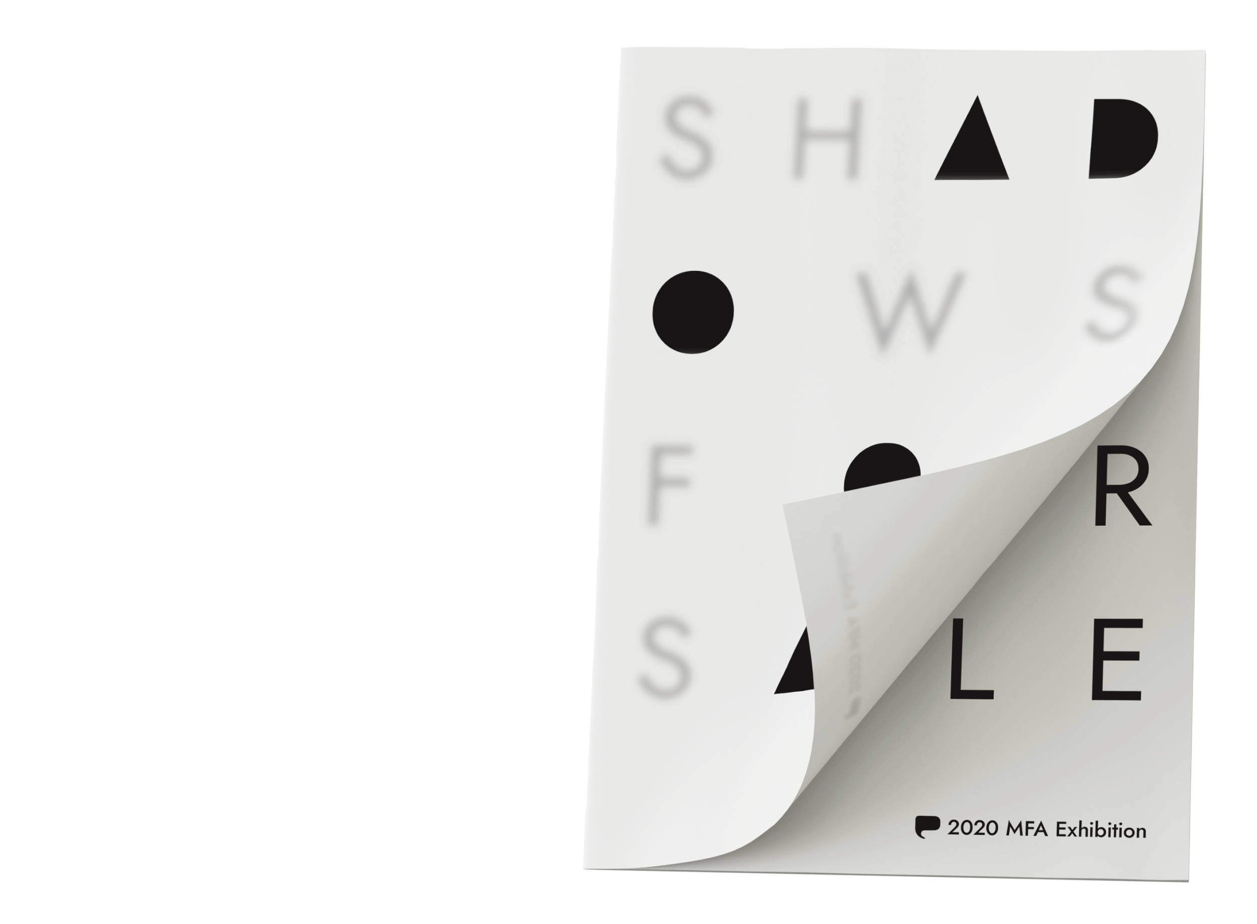
Above: a gif demonstrating the “false cover” of the exhibition pamphlet, which served as the cornerstone of my proposal

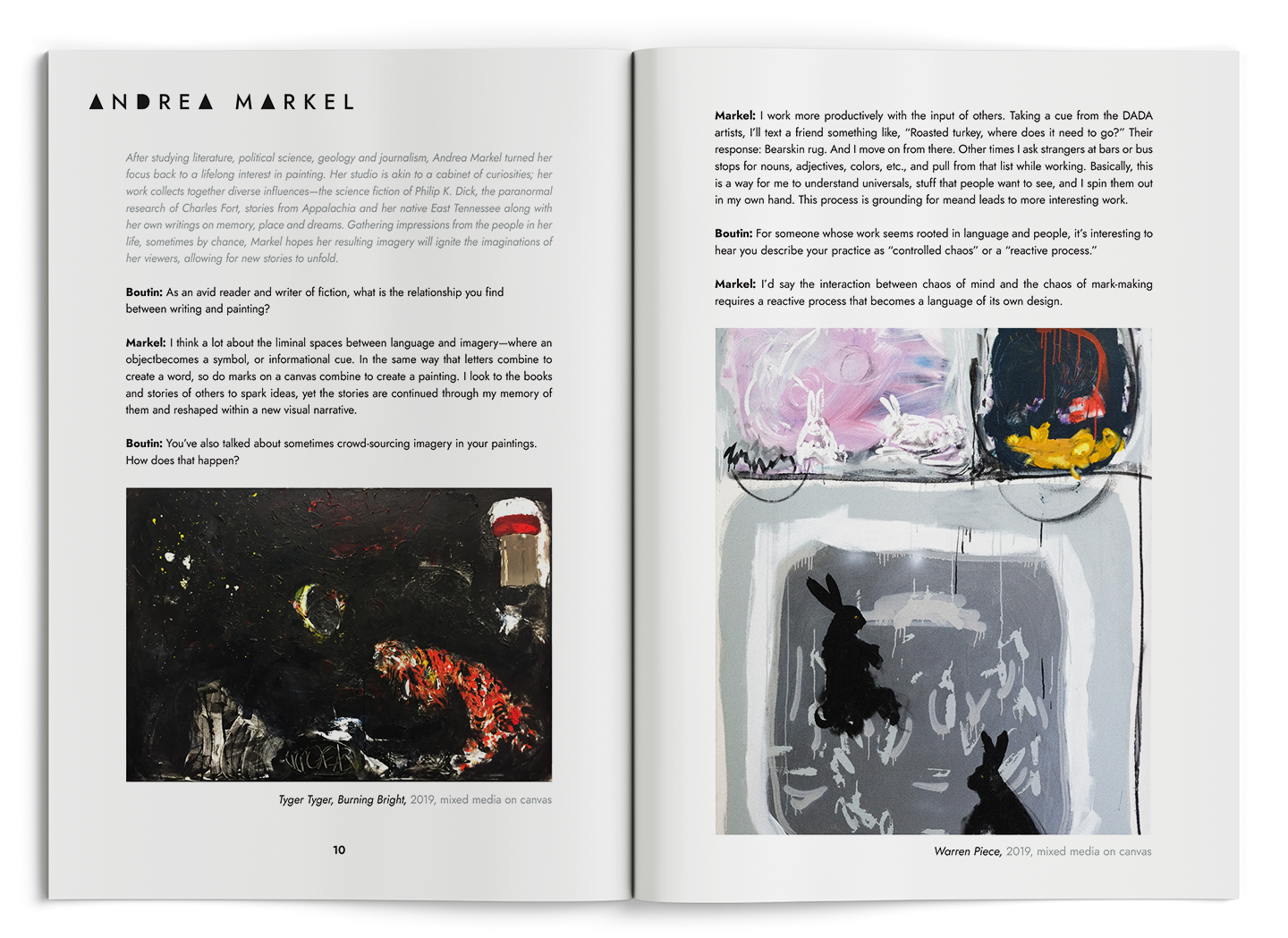
Above: selected spreads from the exhibition pamphlet featuring interviews with participating artists.
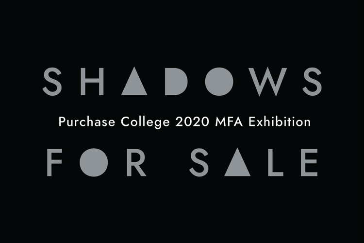
Above: a gif showcasing the front and back of the marketing postcard sent out to the School of Art+Design’s mailing list
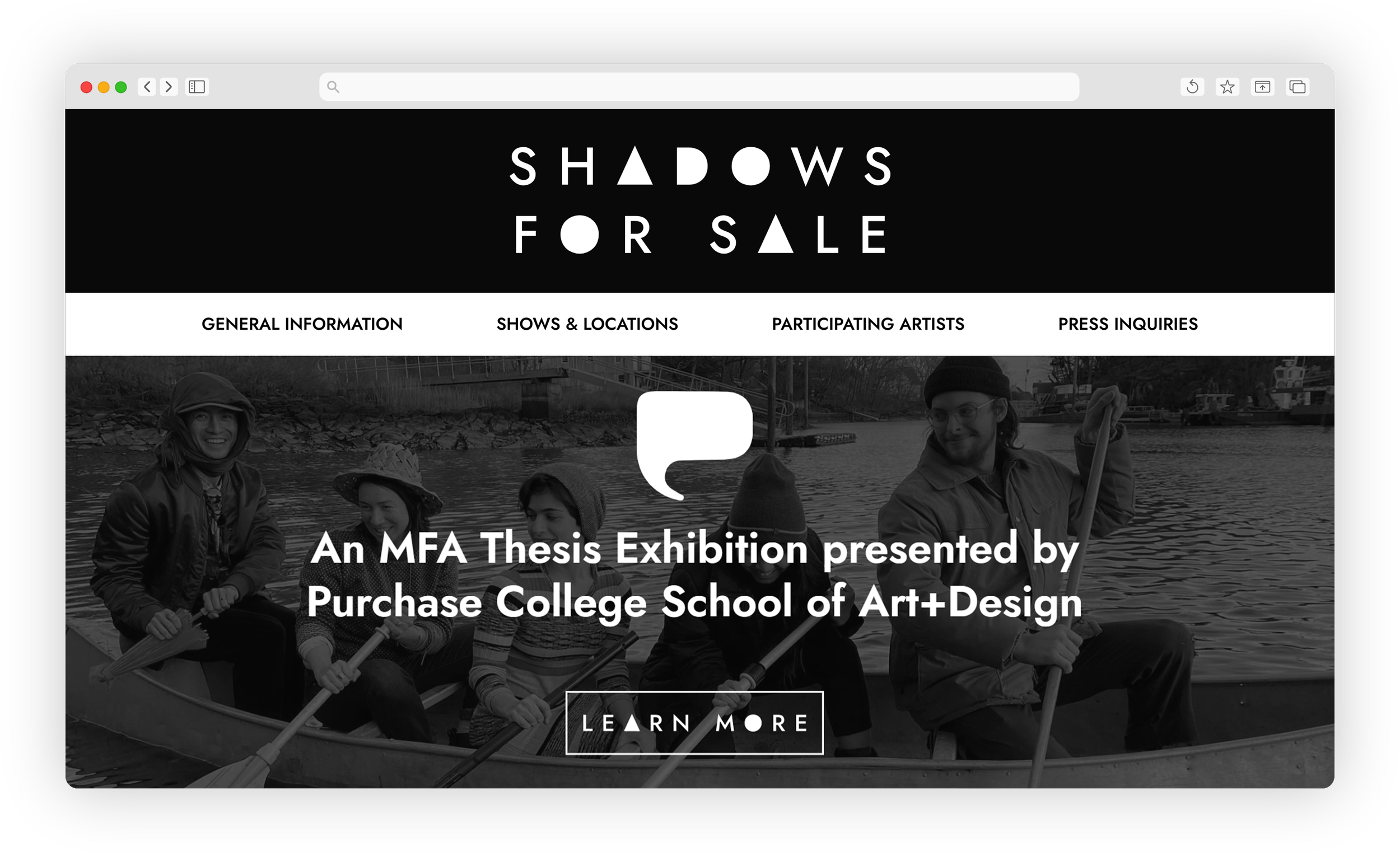
Above: desktop view of the exhibition website’s homepage

Above: desktop view of the General Information page of the exhibition website


Above: additional desktop views of the Shows & Locations page
Above: desktop views of the exhibition website’s Shows & Locations page
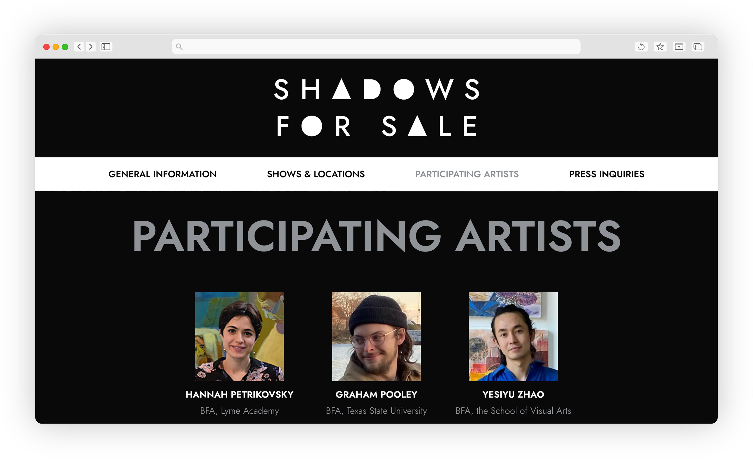
Above: desktop view of the exhibition website’s Participating Artists page